Showing posts with label Paul Auster. Show all posts

Monday, September 30, 2024

The Universal Alphabet: 1 - 7: table; a mountain across the sea; a balding man; a girl looking in a mirror; an oval table; a desk; a chair seen through a window

 *

The Universal Alphabet

The Universal Alphabet was a project I began (probably) in 1993 in Camberwell, South East London, then continued in Maida Vale in West London in 1994 for about another year on and off, before petering out.

The Alphabet consisted of hardboard cards, usually 6 x 9 cm, painted with acrylic paints. 

They are accompanied by an alphabet and a set of numbers which are about 2.5 cm x 2.5 cm in size.

The cards depicted images intended to have an elemental salience.  I`d hoped they might be combined to suggest narratives or convey messages, or be used in a game, the rules of which might be defined by the players themselves. In the course of painting them, however, these objectives were often forgotten and my own subjective ends took over.

The inspiration came from Victorian parlour games and  Ladybird books-  these filtered through Paul Auster (specifically City of Glass from the New York Trilogy), and  the surrealism of Magritte.

A few of these cards have already featured on this blog: I shall now post them all online in about 30 different posts, in no specific order.

*

Tangentially related to these cards these is a simple jigsaw, which I shall also post in due course.

*

The cards are not being posted in any particular order. 

Sizes: all are about 3.5 x 5.5 cm, except A table and A balding man, both of which are 8.5 x 6 cm.

All are available.

*


A table


A mountain across the sea


A balding man


A girl looking in a mirror


An oval table


A desk


A chair seen through a window


*


Thursday, May 2, 2013

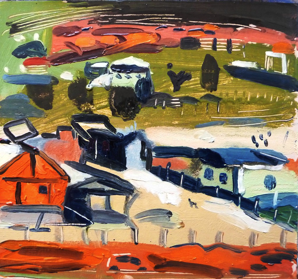
Pedra Branca; New York and painting cities.

Cmbirela with Pedrs Branca, oil on card, 14.5 x 18 cm unavailable


Pedra Branca, lost dog, oil on card, 13.5 x 14.5 cm


I watch with a mixture of bemusement, horror and a sort of perverse admiration as I see another town being constructed here. Brazilians have heard of planning, they even have a planned capital, and very striking it is too, and a planned state capital called Curitiba, but plainly urbanism isn`t something they really want to spend too much of their time bothering with, like the British with cooking and dance.

*

I am trying to set up my New York trip for October. If you can advise on any art contacts, dealers, or galleries that might like my work please let me know.

*

My painting trips have aways confounded my expectations- generally the better I think it is going to be, the worse it is. And the more preconceptions I have about a place, usually garnered from books, films and photos, conversations. the more the reality surprises, or disappoints me.

Generally small unknown places are best- you arrive there without preconceptions, style uncrampted and after, when looking at your pictures no one can respond- Oh but that`'s not how I remember suchandsuch!

I dislike both shoebox modern glass architecture, and molten wax baroque: neither are fun to paint.  Deco is good- so is austere Scottish Georgian. Both have a clear geometry that catches the light. But Po.Mo is nasty. I agree, if one likes Deco one should probably like Foster and Stirling, but somehow they are displeasing, in part because of their awful palette and insistence on humour (groan).

Trashy make-it-up-as-you-go-along Brazilian slum architecture is fun too, with bright colours. jumble, and blurring between interior and exterior spaces, so the private and the public are not so harshly distinguished. And there is still a street life here, at least in poorer neighbourhoods, something which has been virtually banished from the UK.

My notions of New York are founded on a distant memory of the three day trip there back in 1992, books by Singer, Paul Auster, Fitzgerald, Dorothy Parker and Joseph Mitchell; photos by Steiglitz and Feininger and Weegee; films by Woody Allen and Scorsese and songs by Lou Reed.. I.e a peculiar mixture of the sinister and the sentimental and down at heal, or downright squalid, and mostly located between 1920 and 1979.

Much of what I paint in a city is conditioned by where I can comfortably sit, preferably without either traffic bums or salespeople bugging me. Ergo, waterfronts are good, as are cafes at corners and places which are high up. Were I a photographer, my subjects would be considerably different, with much more movement.

Tuesday, June 22, 2010

Smoke (1995): review- 2/10

Talk based picture centred round Keitel's cigar shop in New York and the characters who pass through there.

The film is in-necessarily slow, and becomes boring. This is for various reasons but:

1. The plot does not contain sufficient tension; indeed it just seems to be made up arbitrarily as it goes along. Ergo, it's boring. This is not the same as slow.

2. Harvey Keitel is the only one who can really hold the screen, and the characters are too blank to sustain sympathy.

3. Lighting and scenography aren't used with any imagination- thie film has the washed out look of a cheap tv soap and lacks atmosphere. Where is the use of music also? We want more than a few bars of Tom Waits.

4. The interlacing of lives is too contrived and it's hard to sense that the young black man is really in danger.

5. Lacks the sense of existential revelation which, I think , must play a part in all good art- certainly the existential art Noir-esque of Auster. That is to ask, where is the sense of magic, or the question, what lies beneath it all?

It's peculiar that these difficulties should have arisen from a Paul Auster penned film, given how very well he does atmosphere and narrative and existential questions in his books.