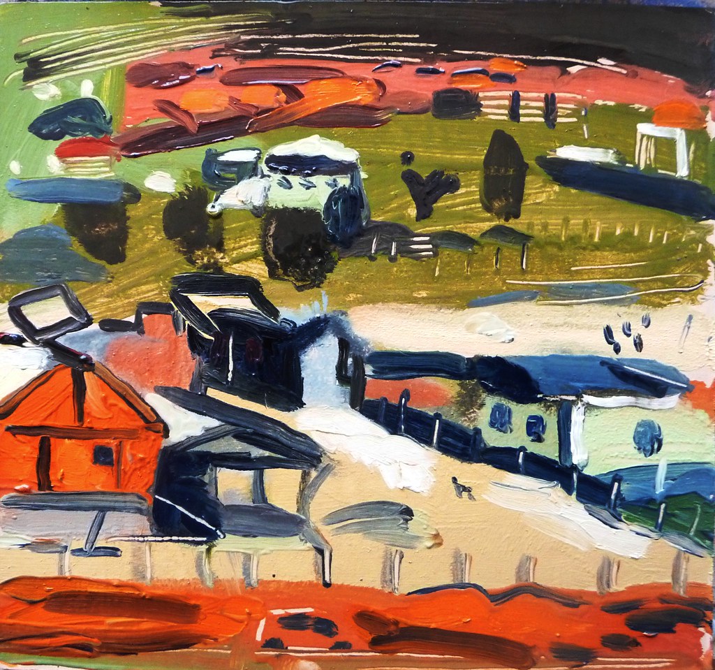
Showing posts with label painting cities. Show all posts

Friday, October 20, 2017

Berwick-upon-Tweed and an exhibition of the Scottish Colourists

*


Berwick-upon-Tweed


The town is solid stone, cheerfully sincere and beautifully situated on the convergence of the Tweed and the sea. It would have been a perfect painting place if the wind had been less strong. The choice of restaurants is not large. There are shops which seem to have been transplanted from the early sixties- traditional butchers or fish and chip shops.

Accents change sharply in from place to place in the UK. There seemed to be no gradation between  the Geordie and the Border Scots.

This lovely town was visited and painted by Lowry- the authorities have marked the places where he painted with information boards. I saw a fine small exhibition at Berwick Visual Arts called Scottish Colourists from the Fleming Collection, which included these lively, unpretentious pictures:


 George Leslie Hunter, Lower Largo, Fife, oil on Millboard, 1919


 George Leslie Hunter, Peonies in a Chinese Vase, oil on board, 1925


Often there are traces of art deco stylisation in the paintings of the twenties.


 J.D. Fergusson, The Drift Posts, oil on canvas, 1922


Samuel John Peploe, Luxembourg Gardens, oil on panel, 1910


*


Thursday, April 21, 2016

Valparaiso; Gran Bretaña; Painting in Valparaiso- conclusions

*


Valparaiso, shops, Gran Bretaña, oil on card, 16 x 15 cm unavailable


Valparaiso,  Plaza Waddington, dog, man, oil on card, 17 x 16.5 cm unavailable


Valparaiso, garage, Gran Bretaña, oil on card, 17 x 17.7 cm- available

This picture has some brown spots

*


Conclusions


I'd expected the trip to be good: I'd been to Valparaiso before and I knew that it would be a fine painting city. It was: it's safe, has variety of levels, nature, great architecture, few cars, sea and the people there leave you in peace. It's also quite cheap.

 The weather was perfect and I stayed in a great location.

Of the pictures, I would say that the pictures are almost all good, with two very good ones. I managed to push the method of Cloisonné (using thick dark lines to delineate forms and then filling them in, much as in Rouault's pictures) forward. It gives a rough effect which suits Valparaiso.

 Mostly, I managed to keep the colours and strokes fresh, and didn't meddle. I seemed to be able to act confidently with the brush. A sense of authority matters a great deal. One must accept that one cannot achieve all objectives. I have a lamentable tendency to say to myself when working "oh but why don't I paint that thing instead" ,or, "perhaps I should work on a larger scale",  for example. But to achieve one objective it is necessary to sacrifice others. In the aesthetic sphere, imaginative souls will always find themselves partly unsatisfied with the option they choose. 

One of the most common false criticisms is when viewers make category errors, in my case, "it is a pity it is small", which is like responding to a Chopin mazurka with "Why doesn't it go on for longer?". The mazurka's musical virtues and its concision are not seperable properties, any more than the small size of my picture is irrelevant to what I am expressing. 

I digress. Emboldened, I look forward to  Peru, in June.


*

Thursday, March 3, 2016

Valparaiso revisited

*


From Stanfords Library Series, 1912


I was so impressed by Valparaiso as a painting city that I'd had, since my visit there back in June, 2012, the idea of returning to do more paintings. So I'm returning in early April.

In many ways it's an ideal painting city: not too big and set on many hills with splendid views, great crumbling 19th century architecture and and that Tom Waitsian atmosphere of abandon. The light was clear and the people weren't annoying.

I have a feeling that I'll visit relatively few totally new places this year, there being so much pleasure in revisiting the old and capitalizing on the benefits of hindsight and the knowledge of the place that I've garnered, There is also considerable pleasure in seeing if one has advanced in any way creatively too.

But revisiting is an art in itself. If one revisits too soon, and one might as well never have left. What is nice is for ones memory to have blurred a little and for the place or oneself to have changed sufficiently to incur surprise,  to discover other perspectives, and feel delight, 


*

Monday, May 4, 2015

April in Britain and France: Part Three: Glasgow

 *


 Shop fronts, West End, Glasgow, oil on card, 14 x 15.5 cm  SOLD


 A close, Glasgow, oil on card, 14 x 16 cm


 A view from the Necropolis, Glasgow, oil on card, 13 x 18 cm  SOLD


A bridge near Glasgow Green, oil on card, 16 x 13 cm  -   available


Factory along the Clyde, Glasgow, oil on card, 15 x 16 cm -  -unavailable


I spent five days in Glasgow, mostly in the West End. I'd always felt very ignorant about Glasgow, having grown up and studied in Aberdeen and Edinburgh and there being a strangely exaggerated antipathy between East and West coast in Scotland, despite, or perhaps because of, their proximity.

Most of my thoughts about Glasgow were formed by a few childhood visits, by Frank Kuppner's A Very Quiet Street, and books about architects Alexander "Greek" Thomson and Charles Rennie  Mackintosh and my notions were somewhat romantic. 

I wasn't disappointed. it's a fine painting city: spaciously laid out with great views. There are few tourists. It doesn't feel like a huge museum, and yet it has a clear identity.The weather was delightful. People left me in peace to work, or were friendly without being overbearing. There are lovely little cafes and places to eat.

It's a  schizophrenic city: the West End and centre is genteel, with magnificent 19th century apartment blocks, museums and charming cafes, while the rest of the city appears to be in a post Imperial, post-industrial condition, with empty land free for construction and a sense of incompletion. This makes it a marvelous subject, and I enjoyed painting from the Necropolis, and along the Clyde.

The first picture is one of the best of this year: economical and cool.


*

Sunday, May 3, 2015

April in Britain and France: Part Two: Paris

*


 Paris, oil on card, 16 x 18.5 cm    AVAILABLE


 Montmartre, oil on card, circa 18 x 16 cm     Available at No 31 Gallery


The two above are the result of my perambulations in central Paris: not an especially easy place for painting, given the crowds of tourists who make it difficult to work peacefully. And, as a generality, famous landmarks rarely make for good paintings, as it is very difficult to develop an original attitude to them. But I am very pleased with my Eiffel Tower picture.

I would have been better off with an easel: I have since acquired a portable one: rather heavy.

The three below are from or near my little apartment in the 12th Arrondissement, Bercy, which I found more satisfactory, partly because there is so much space to work, and partly because it is not really part of the museum city, and has industrial and railway features that, aestheticised, have a definite anarchic visual appeal.

For many painters, French painting is a touchstone: this is certainly the case for me, and a trip to France is in some way inevitably a homage, specifically in my case to painters such as Utrillo or the Impressionists. I think my picture of Montmarte has sufficient Utrillo in it to count as a homage.


Railways, Bercy, oil on card 16 x 18 cm  - available


This picture, above, has many damp spots


 Bercy, looking West, oil on card, 16.5 x 22.5 cm  AVAILABLE


Near  Bois de Vincennes, Paris. oil on card, 16 x 18 cm     AVAILABLE


Rooftops, Bercy, Paris, oil on card, 16 x 18 cm  AVAILABLE


*


Many thanks to Frédéric Glorieux for his kindness in Paris.

*

Friday, May 1, 2015

April in Britain and France: Part One: London

*


 Hampstead Heath, oil on card, 18 x 16 cm   SOLD


 Berkeley Square, North side, oil on card, 17.5 x 17 cm   AVAILABLE


The colours here are gaudier than is truly the case


 Here are my first offerings from April's painting trip, which took me from Brazil to London, then to Paris, to Scotland, Somerset and back to Brazil via London.

London is not a good painting city. It lacks dramatic landscapes. The weather is both bland and unpredictable and the season changes lack force. The architecture is often good, but is also often fussy or indecisive, as is the street plan which rarely accommodates grandeur. And the city is uncontained,  rolling lazily in from endless suburbs and shires, undefined.

At the same time it lacks the sort of street life that makes Morocco, say, fascinating. In London, the private is utterly hidden. It cannot be intimate with you. It's true that you can sometimes get interesting views into the backs of people's gardens from railway lines but its hard ever to be able to find a place to paint them. And they aren't that fascinating anyway.

I never really "got" London, though I lived there for ten years, I seldom found it mysterious or enchanting except in old books or through the eyes of others such as writers like Ian Sinclair or painters such as Auerbach, though I came to love the more obscure stretches of Kensington and Bayswater. But most of it makes me shrug my shoulders.


Princes Square, Bayswater, oil on card, 14.5 x 16 cm  - available


*

Many thanks to Lise and Felix for their generous hospitality in Westbourne Grove.


*


Saturday, November 2, 2013

New York V: above Queens; evaluation

*


Above 43rd St., Queens, the back yards, oil on card, 13 x 12 cm

 There is something of Eardley here.


Above 43rd St., Queens, looking North-West, oil on card, 14 x 13 cm AVAILABLE


Above 43rd St., Queens, N.Y., looking down, oil on card, 12 x 12 cm


These three paintings were executed from the roof of my lodgings.

 If I regret anything about the US trip, it is that I did not paint anything close up, intimately.

 All painters have their distances: Lucien Freud or Chardin work much closer to his subject than, say, Turner does. And different cities condition different distances, so that panoramic views are a more likely response to Rio than perhaps to Camden. But I think if i were to revisit, I would try to get closer to my motifs, at least sometimes.

*

The trip was, I think the most successful of my longer painting trips so far. The weather was magnificent, the light perfect and  the city is easy to understand and it is dramatic. The decision to focus on Queens, a rough 4 mile radius from my lodgings was wise, allowing me to explore without getting bored. 

I came to love Queens: it is ordinary but then quite beguiling at the same time, with an incredible mixture of unpretentious people from all over. I didn`t find any architectural marvels there- it is strange to me how few Churches there are- but there is a huge amount of good solid ordinary building, both blocks and townhouses -the sort that is so woefully lacking in Brazil- all laid out on an elegant grid, sloping easily down to the river, punctuated by small parks here and there.

*


Many thanks to James for putting me up on my first days in the USA and for helping me, and to Tatiane for bravely and brilliantly assuming the role of  photographers assistant.

*


Tuesday, June 18, 2013

Montevideo, Uruguay- the last painting days of my trip

*


The final place where I did any painting was Montevideo: a delightful city: I stayed in Pocitos, an elegant amalgam of 19th century and 20th century urban styles, lined with autumn trees.
*

Mostly the trip was a success: I worked very hard and was quite prolific- there were a few duds but not too many. Travel is tiring and painting are quite intense activities, and after about ten days I started to weary- perhaps I should have paced myself more evenly, allowing more breaks and days off. Stylistically, the pictures went  from tight to loose:  perhaps this was partly a result of falling concentration.

The countryside in Uruguay was more interesting to me, as a painter, than the city of Montevideo. In the country, the feeling of having stepped back in time, the absence of cars and the presence of horses, the little houses, and the wonderful bright winter light, and the way the landscape is open but not featureless all made it a good painting place for me. The weather doesn`t change every half hour from bad to worse as in the UK. And Uruguay feels safe: children don`t throw stones at one as in Arab countries, nor do traders harry one constantly; and there aren`t stray dogs all over the place, or the sense that things are barely in control, as in Brazil. The people are markedly more reserved than in Brazil, though I found them to be very pleasant.


*

Many thanks to Ricardo Merlinski for his generous hospitality at his elegant apartment in Pocitos: the gardens above are those from his place.


*

Thursday, May 2, 2013

Pedra Branca; New York and painting cities.

Cmbirela with Pedrs Branca, oil on card, 14.5 x 18 cm unavailable


Pedra Branca, lost dog, oil on card, 13.5 x 14.5 cm


I watch with a mixture of bemusement, horror and a sort of perverse admiration as I see another town being constructed here. Brazilians have heard of planning, they even have a planned capital, and very striking it is too, and a planned state capital called Curitiba, but plainly urbanism isn`t something they really want to spend too much of their time bothering with, like the British with cooking and dance.

*

I am trying to set up my New York trip for October. If you can advise on any art contacts, dealers, or galleries that might like my work please let me know.

*

My painting trips have aways confounded my expectations- generally the better I think it is going to be, the worse it is. And the more preconceptions I have about a place, usually garnered from books, films and photos, conversations. the more the reality surprises, or disappoints me.

Generally small unknown places are best- you arrive there without preconceptions, style uncrampted and after, when looking at your pictures no one can respond- Oh but that`'s not how I remember suchandsuch!

I dislike both shoebox modern glass architecture, and molten wax baroque: neither are fun to paint.  Deco is good- so is austere Scottish Georgian. Both have a clear geometry that catches the light. But Po.Mo is nasty. I agree, if one likes Deco one should probably like Foster and Stirling, but somehow they are displeasing, in part because of their awful palette and insistence on humour (groan).

Trashy make-it-up-as-you-go-along Brazilian slum architecture is fun too, with bright colours. jumble, and blurring between interior and exterior spaces, so the private and the public are not so harshly distinguished. And there is still a street life here, at least in poorer neighbourhoods, something which has been virtually banished from the UK.

My notions of New York are founded on a distant memory of the three day trip there back in 1992, books by Singer, Paul Auster, Fitzgerald, Dorothy Parker and Joseph Mitchell; photos by Steiglitz and Feininger and Weegee; films by Woody Allen and Scorsese and songs by Lou Reed.. I.e a peculiar mixture of the sinister and the sentimental and down at heal, or downright squalid, and mostly located between 1920 and 1979.

Much of what I paint in a city is conditioned by where I can comfortably sit, preferably without either traffic bums or salespeople bugging me. Ergo, waterfronts are good, as are cafes at corners and places which are high up. Were I a photographer, my subjects would be considerably different, with much more movement.

Saturday, February 23, 2013

A trip to Egypt: Aswan, part 2: the town; painting cities

*


 Aswan, looking down from the Keylany Hotel restaurant, oil on card, 16 x 12 cm


Aswan- behind the Keylany Hotel, oil on card, 13 x 11 cm - available


Aswan- parked cars, people, sun, oil on card, 10 x 12 cm


Aswan, shops, people, sun, oi lon card, 10 x 12 cm  AVAILABLE


Aswan- near the station, a shop and an entrance, oil on card, 12 x 15 cm  AVAILABLE


This is the final selection from Egypt and the town of Aswan, parts of which have an almost soviet feel, in terms of architecture and street planning.

Chaos and colour are much more inspiring than sobriety and order, however. Mess is revealing, order disguises.

 The best painting cities for me combine disorder, with good light, and interesting topographical features, such as hills, or rivers or canals. It helps if they have a variety of architectural styles, but this ins not very important for me

More important is if the industries or trades that are practised in that city can be seen publicly- stalls selling things, clothes being repaired, food being cooked, ships loaded or unloaded, and so forth (I once read that London never managed to produce the array of photographers that Paris did in the 30s, with Doisneau, Kertesz, Cartier Bresson and Brassai, because London life is so much more private and interiorised than Parisian life, and so much less enjoyable to photograph- an example being how the London pub is an enclosed space where the Parisian cafe is open to view by the general public. I am not sure if this argument really stands up to analysis, however, since there was surely no shortage of street markets, children playing street games and sports events, etc in London in the 20 and 30s).

 Good painting cities also have to be safe places with ready access to public spaces.The people should be pleasant and respect one while one is working.

Rio is a good painting city, but it's unsafe. London lacks consistently good light, and its people conduct their trades (which are often visually uninspiring,) on computer screens behind closed doors. Italian cities are often sanitised- Catania and Naples, of the places I`ve been are exceptions). Egyptian cities are good in most aspects but spoiled by hassle, which is why I worked so often for roofs and cafes, safe from sellers.


*